Planning an exhibition stand – from the idea to a convincing presentation
An exhibition stand is far more than just a spatial construction – it is the most visible and immediate form in which a brand takes shape. This is where strategy, design, communication and emotion come together directly. Nowhere else are brand values so condensed and experienced as directly as on the exhibition floor. In an environment full of stimuli and visual competition, the first impression determines success or failure: is a stand noticed, understood and remembered – or does it get lost in the crowd?
An effective presentation is not created by chance, but through precise planning, strategic clarity and perfect craftsmanship. It's not about being the loudest, but the clearest. An exhibition stand functions like a three-dimensional business card – it embodies the identity, values and quality of a company at first glance.
But how does an idea become a space that really reaches people? How do you create an appearance that not only informs, but also touches? This text shows the path from the initial idea to professional implementation – step by step, practical, tried and tested and inspired by hundreds of successful projects from MARTINCOLOR's experience.
From goal to idea – why strategy comes before design
Every successful exhibition stand begins with a clear goal. Form, color and function must lead to a strategic intention. Without strategy, design remains superficial – with strategy, it becomes an instrument of precise brand communication. If you don't know why and for whom you are exhibiting, you can't know what effect the stand should have. That's why every project starts with the question: What do we really want to achieve?
A product launch requires a different language than an image campaign. While a launch needs attention, movement and excitement – for example through high-contrast color surfaces, dynamic lighting accents or a striking exhibition back wall – an image presentation requires calm, stability and clarity. It should create trust, not provoke it. Every shape, every line, every color contributes to conveying this goal.
Strategic planning answers fundamental questions: Who is our target group? What message do we want to convey? How do we want visitors to feel when they enter our stand? And which media or campaigns best support this goal? These questions sound simple, but they determine everything else – the architecture, the choice of materials, the lighting, even the clothing of the stand personnel.
A design briefing is created from the answers, which later enables the creative translation. A good briefing saves time and money because it avoids misunderstandings. It defines the content basis on which designers and technicians work. The integration of media – such as digital displays, projections or interactive elements – is decided strategically, not on instinct. An illuminated wall or LED exhibition wall can attract attention, but the content must match the brand.
An exhibition stand with a clear strategic basis appears calmer, more credible and more professional. Visitors immediately notice when a concept has been well thought out. They notice when every surface, every light source, every color has a function. This creates trust – and that is the prerequisite for every successful customer meeting.
The trade fair as a stage for the brand
A trade fair is not just a sales area, but a stage. This is where people, brands and messages come together. If you use this stage correctly, you can transform your trade fair stand into an experience area that captures attention and remains in the memory. Visitors decide in seconds whether they feel addressed – or move on. A successful presentation manages to translate the essence of a brand into space, form and light.
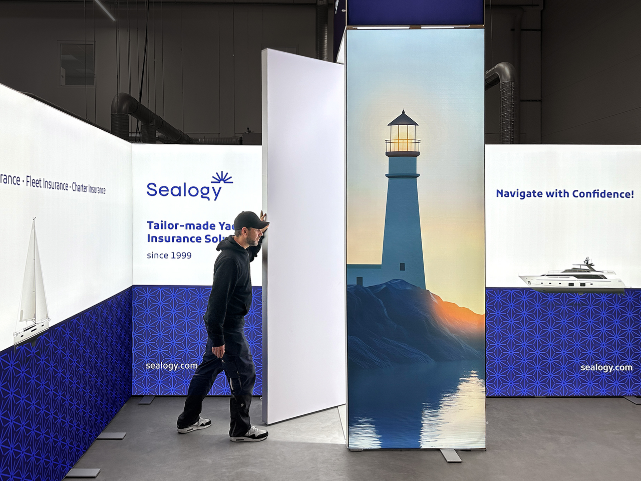
The architecture of a stand tells stories even before an employee has said a word. Colors, lighting and materials determine the atmosphere. An open front creates transparency and invites people to enter, while a clearly structured exhibition back wall provides orientation and defines the space. Large, homogeneously illuminated surfaces – such as an LED exhibition wall – attract attention even from a distance. They create a long-distance effect, signal presence and strengthen the brand identity. At the same time, an illuminated wall can create depth, mood and atmosphere. The targeted use of different light zones supports the dramaturgy – from the first eye contact to the personal conversation.
An exhibition stand that functions as a stage combines information and emotion. It is not about showing everything, but about clearly highlighting the essentials. The product, the brand and the message must take center stage. Every decision – whether color choice, font size, material or shape – contributes to perception. Even the color temperature of the light or the texture of a table influence whether visitors feel welcome or remain distant.
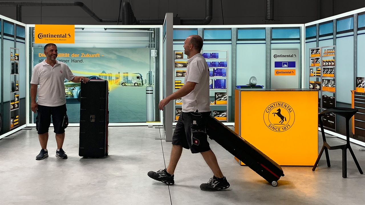
Even compact mobile exhibition stands can become a powerful brand stage if the proportions, lighting and design are precisely coordinated. A mobile exhibition stand can radiate professionalism, dynamism and brand awareness even in a small space. The attitude is crucial: the stage is not a place to hide, but a place to show who you are. A brand that radiates self-confidence, quality and credibility there will be remembered – long after the exhibition halls have closed.
Design with impact – what makes a stand unforgettable
Design determines how people perceive spaces. An exhibition stand is communication in space – its design is the visual language of a brand. It works intuitively, even before a visitor thinks rationally. Good design is never an end in itself; it creates orientation, arouses emotions and tells a story.
Colors are the fastest means of communication. Blue signals trust, competence and precision; green stands for naturalness and sustainability; red has an activating and energetic effect; gray, white and black convey elegance and neutrality. The balance is important: too much stimulus is overwhelming, too little looks pale. A professional stand design derives colors from the corporate identity and translates them into a spatial effect.
Light is the second decisive factor. An LED exhibition wall attracts attention even from a distance, while warm light in consultation zones creates proximity. Dimmable light makes it possible to control the atmosphere throughout the day – bright and inviting in the morning, softer and more relaxed in the evening. The direction of the light is also important: indirect light creates calm, spot lighting directs the eye.
Materials appeal to the sense of touch – and this plays a bigger role than you might think. Textile clamping frames with high-quality printing look light, modern and professional. Aluminum profiles convey precision and technical expertise, while wood or fabric surfaces radiate naturalness and warmth. Their combination creates depth – both visually and emotionally.
A good design guides visitors without pushing them. A clearly structured exhibition back wall provides orientation, open corners are inviting and different heights create dynamism. Movement is a central design element: a well-thought-out walkway unconsciously guides visitors through the stand and directs their attention to the most important elements. The space communicates – quietly but effectively.
In the end, it's not about effects, but about impact. An exhibition stand is memorable when it is coherent – when colors, shapes, light and materials harmonize and together create a feeling: the feeling that everything is right here.
From system to experience – modular solutions with character
A modern modular exhibition stand must be flexible, lightweight and reusable without losing any of its expressiveness. Tailor-made concepts make this possible. They combine technical precision with aesthetic appeal. In times when sustainability, mobility and cost-effectiveness are becoming increasingly important, well thought-out solutions provide the ideal basis for brands that regularly exhibit at trade fairs.
A mobile exhibition stand can be set up, adapted and extended in a short time. Modular exhibition walls create a uniform appearance that easily adapts to different stand sizes. The technical precision of these systems – lightweight frames, crease-free stretched textile graphics, uniform illumination – ensures a professional overall look that remains easy to handle.
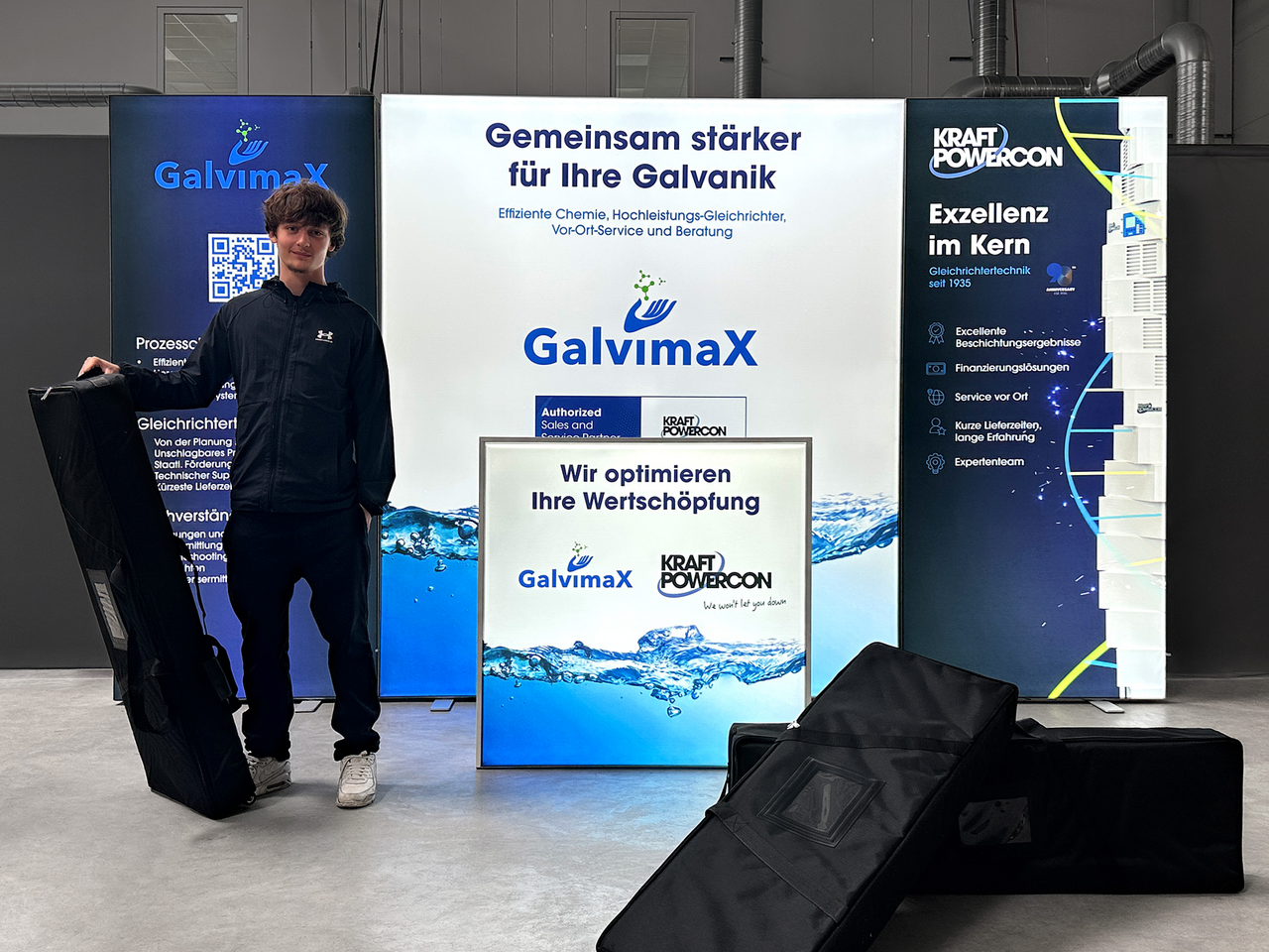
Thanks to interchangeable graphics, campaigns can be updated quickly. Companies can use the same basic design for different appearances by simply changing the prints. This saves time, storage space and costs. At the same time, the brand remains consistent – the stand changes, the identity remains.
These systems are also impressive in terms of sustainability: Reusable profiles, long-lasting LED modules and compact transportation solutions significantly reduce resource consumption and logistics costs. This combines technical thinking with ecological responsibility.
An individual appearance is not a compromise, but an extension of the possibilities. It allows creative freedom without losing sight of economic efficiency. Whether a compact stand for regional trade fairs or a representative installation at leading international events – MARTINCOLOR develops exhibition stands that grow with you, adapt and always clearly convey the brand. Design, technology and communication interlock – for appearances that not only work, but also inspire.

Trade fair psychology – how to direct visitor flows
Successful exhibition stands not only use good design, but also psychological principles. People behave according to certain patterns at trade fairs – they are guided by light, movement, lines of sight and other people.
The first impression is usually formed in less than three seconds. What the visitor sees first influences their decision as to whether they stop. The key visual should catch the eye from a distance – for example on a large LED exhibition wall. Moving elements can help to attract attention without being intrusive.
People instinctively avoid confined or cluttered spaces. A clearly structured stand appears more open and friendly. Entrances that are slightly diagonal lower the inhibition threshold for entering, while light zones guide people through the space like signposts.
The positioning of the most important elements is best done according to a psychologically sensible sequence:
Attraction point – e.g. an LED exhibition wall or a striking product in the entrance area
Information zone – displays, brochures, advice
Dialogue zone – seating, quiet area, personal conversations
This principle guides visitors through the stand in a natural way without consciously directing them. Colors and light subtly influence behavior. Bright, warm colors and soft light create openness and calm, while contrasts increase attention. Excessively bright or changing lighting effects, on the other hand, create unease – they are more distracting than effective. Temperature and acoustics also play a role. A slightly subdued, pleasantly bright room ensures that visitors stay longer.
An exhibition stand with a clear structure and calm atmosphere looks competent and confident – regardless of its size. In the end, what counts is what sticks. A visitor rarely remembers figures or technical facts, but the feeling that a space has triggered. When an exhibition stand creates positive emotions through colors, light and encounters, a lasting connection to the brand is created. The best stands guide without instructing. They make orientation easy, encounters pleasant and communication a matter of course.
The perfect exhibition stand is teamwork
No exhibition stand is created single-handedly. It is the result of many minds and hands working together on an idea – designers, technicians, printers, fitters, project managers and, of course, the customer himself. When all these areas work together, the result is an appearance that works – visually, technically and emotionally.
Communication is at the heart of this. From the initial briefing to the on-site installation, everyone involved must know what needs to be done, what decisions have been made and where there is still room for maneuver. Open communication saves time, prevents misunderstandings and ensures that design, technology and logistics are perfectly coordinated.
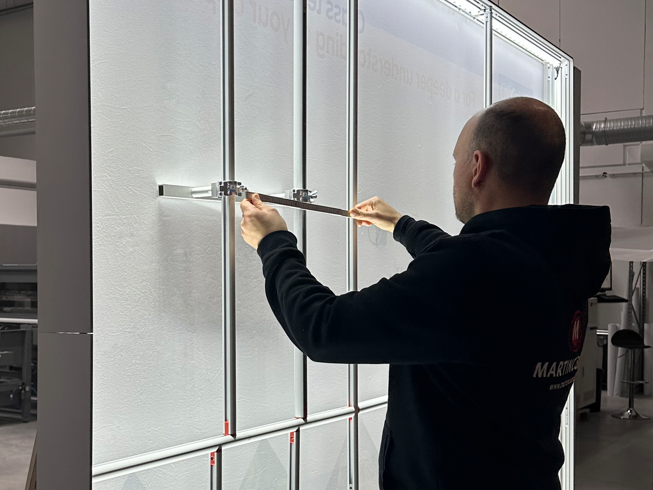
Experience plays a decisive role. A precise project plan, clean data preparation and coordination between graphics, printing and system construction make the difference between “works somehow” and “works perfectly”. A neatly stretched exhibition wall and uniform lighting signal professionalism – and that is exactly what the visitor senses.
Flexibility is the key. Circumstances often change during set-up – a power connection is installed differently, the neighboring stand is larger than expected. A well-coordinated team reacts calmly, solution-oriented and efficiently. Teamwork means that technology, design and organization work hand in hand.
After the trade fair is before the trade fair. Analysis, documentation and optimization are all part of the process: What worked, what can be improved? Every experience flows into the next presentation. This creates a continuous improvement process that makes quality measurable.
A perfect exhibition stand is the result of a clear idea, a strong concept and precise implementation. However, it is crucial that strategy, design, technology and people harmonize with each other. A stand is successful when it combines brand identity, functionality and emotion.
An exhibition stand should never just fill space, it should create meaning. It should arouse curiosity, provide orientation and facilitate conversations. MARTINCOLOR stands for precisely this claim: systematic design that makes brands visible and arouses emotions – because an exhibition stand is the face of a brand in space.
An exhibition stand is more than just a construction of light and graphics – it is the spatial translation of a brand. When strategy, design and technology work together harmoniously, the result is an appearance that works because it is honest.
What counts in the end is not how loud a stand is, but how clearly it speaks. A well thought-out concept, precise implementation and attention to detail make the difference between “being seen” and “being remembered”. MARTINCOLOR develops appearances that make brands visible and arouse emotions – with experience, sensitivity and a passion for design that lasts.
MARTINCOLOR GmbH & Co. KG
Gaugrafenstraße 24 d | 60489 Frankfurt am Main | Phone +49 (0) 69 756080-0 | Fax +49 (0) 69 756080-88 | info(at)martincolor.de
OUR OPENING HOURS
Monday – Friday from 9 a.m. to 6 p.m.


